There are some artwork terms that are specific to our purposes in the screen printing industry. These are the terms you should know and understand when talking with artists and with your screen printing staff.
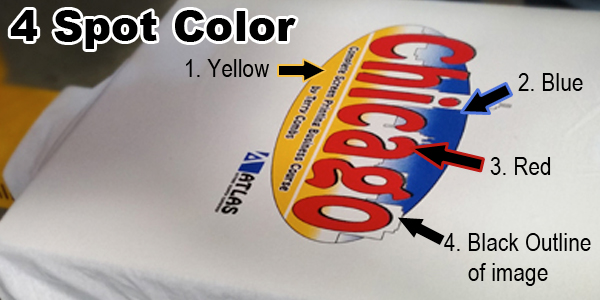
Spot Color Most of what you see in garment screen printing is spot color. For
example, on a white shirt you might see a black outline image with a
color or two or three filling the image area. This is spot color, as
opposed to a photographic reproduction. Clip art school mascot designs
printing in two or three colors are good examples of spot color
printing.
You are not limited to white shirts. Spot color images
can be manipulated to print on any color garment, and will generally
have an outline of either black or white ink, depending on the color of
the garment. Shading with halftones and gradations of color within the
spot color image are also common to give the illusion of additional
printed colors and depth to your image.
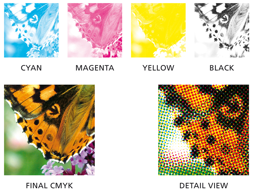
Process Printing Process printing utilizes CMYK - Cyan, Magenta, Yellow and Black - and is most commonly printed on white
garments. These inks are transparent and will take on the color of the
fabric they are printed upon. A yellow print on a light blue shirt will
result in a green image. That’s why, for CMYK, a white garment is your
best option.
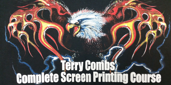
Simulated Process This is your best choice when printing full
color images on any color garment. Unlike transparent CMYK inks,
simulated process uses opaque plastisol ink colors such as lemon yellow and scarlet red,
printed using halftone dots to simulate process printing. Most full
color images you see on black shirts for instance will likely have been
printed using simulated process.
At least a six color press is recommended for this type printing. And a Photoshop plug-in program, specific to garment printing, is recommended to create these full color separations as well.
Index Printing Unlike simulated process which uses halftone
dots, index separations will use a series of square dots to create the
image. Index printing is color hungry. In other words, to create a full
color image, more than six colors will likely be required to achieve the
same effect as simulated process. Index printing is commonly used to
created a posterized effect from a photographic image.
Halftone Frequency - This means the number of dots-per-inch
(DPI), also known as lines-per-inch (LPI). Frequency determines the size
of the dots you are going to print. The bigger the dot, the easier it
will be to hold these dots on the screen and print onto your garment. Manual printers will not commonly go above 55 LPI. Automatic printers will usually go no higher than 65 LPI.
Setting
halftone frequency is done under the Advanced Settings option when you
send your artwork to print. The default settings on your printer will be
much higher and will not work for screen printing. This is a common
error for new printers when they attempt to use halftone dots in a
graphic for the first time.
Dot Shape - The dots we print are not perfectly round. Rather in garment printing, we will most often choose elliptical dots.
Dot Angle
- Halftone dots are printed along a straight line unless we specify
otherwise. It is important that we do not allow this straight line of
dots to align with the straight lines of our screen. This alignment may
result in a moiré effect, causing patterns to appear on your screen and
in your image. Dot angle is set under your Advanced Settings tab when
you go to print.
Tip: For your spot color designs and for simulated process printing, set the angles for all colors at 25.
If
you are printing with process inks, set each color at a different angle
so that the actual dots from one screen to the next will not align and
cause a moiré pattern between colors.
TIP - The dot angles to set by color for process printing will be:
- Cyan - 15 degrees
- Magenta - 45 degrees
- Yellow - 75 degrees
- Black - 75 degrees
Registration Marks
- These marks are printed on each film so that it is easier to align
artwork and screens on the production floor. Most commonly registration
marks will appear on all four corners of the image. But in screen
printing, placing two registration marks, centered at the top and bottom
of an image will allow you to line them up with a straight line down
the center of your platen for a quick setup and a perfectly centered
image on the garment.
Butt Registration - Artwork prepared with butt registration means the edges of each color are lined up with one another with no overlap.
Trapping
- This means the colors in the graphic are slightly spread to hide
under the black outline of your graphic. Trapping is most common when
printing spot color images, and will help to speed setup. Be careful of
too much trapping. This may cause your image to look muddy where the
colors overlap. Limit trapping of your image to about 2 points.
Stroke
- Increasing the outline thickness of an image is used to make the
outline screen easier to line up on the press (by overlapping other
colors). Increasing the thickness of the outline is commonly called
increasing the stroke.